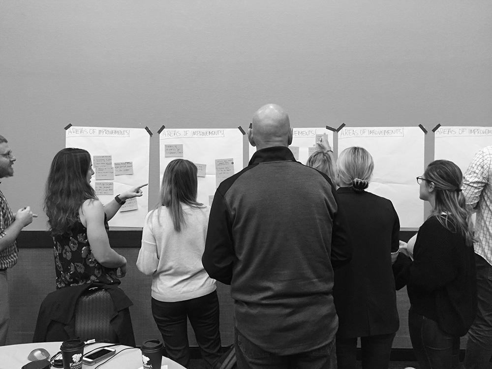
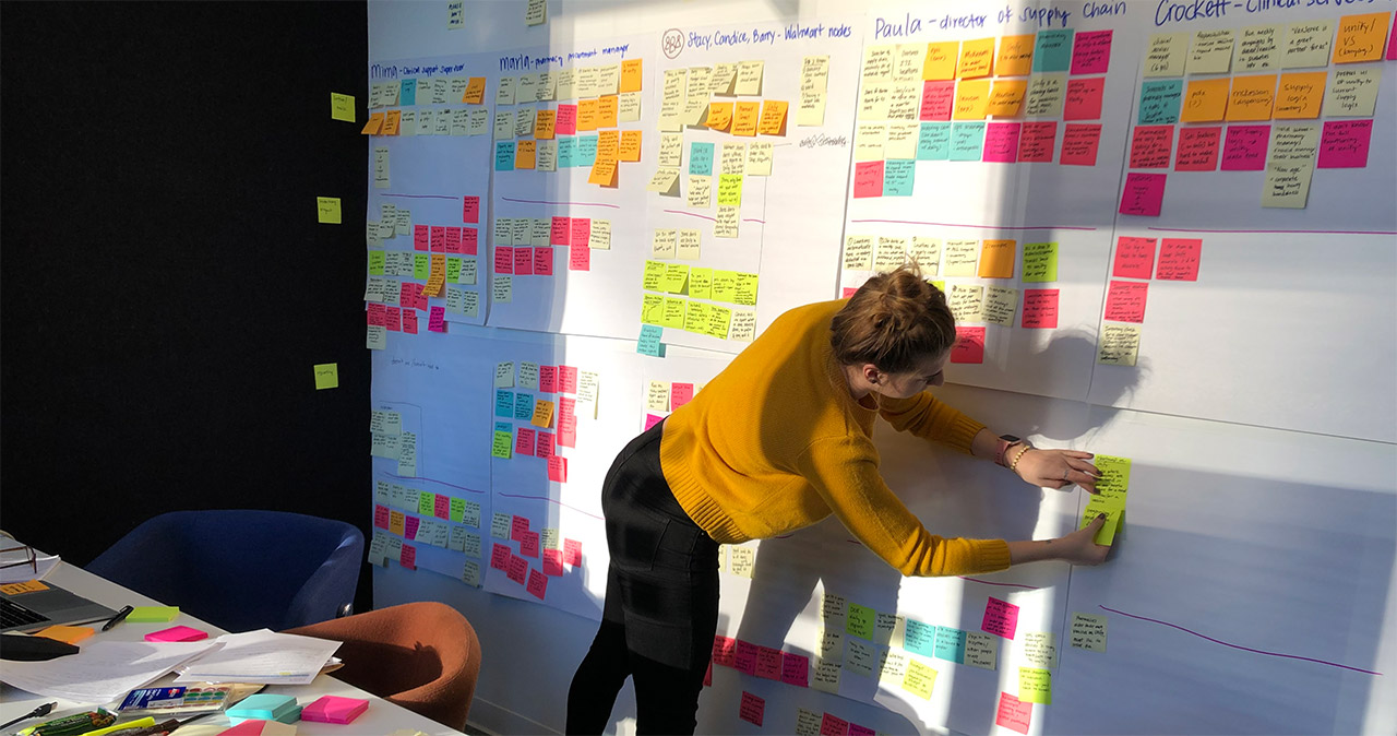
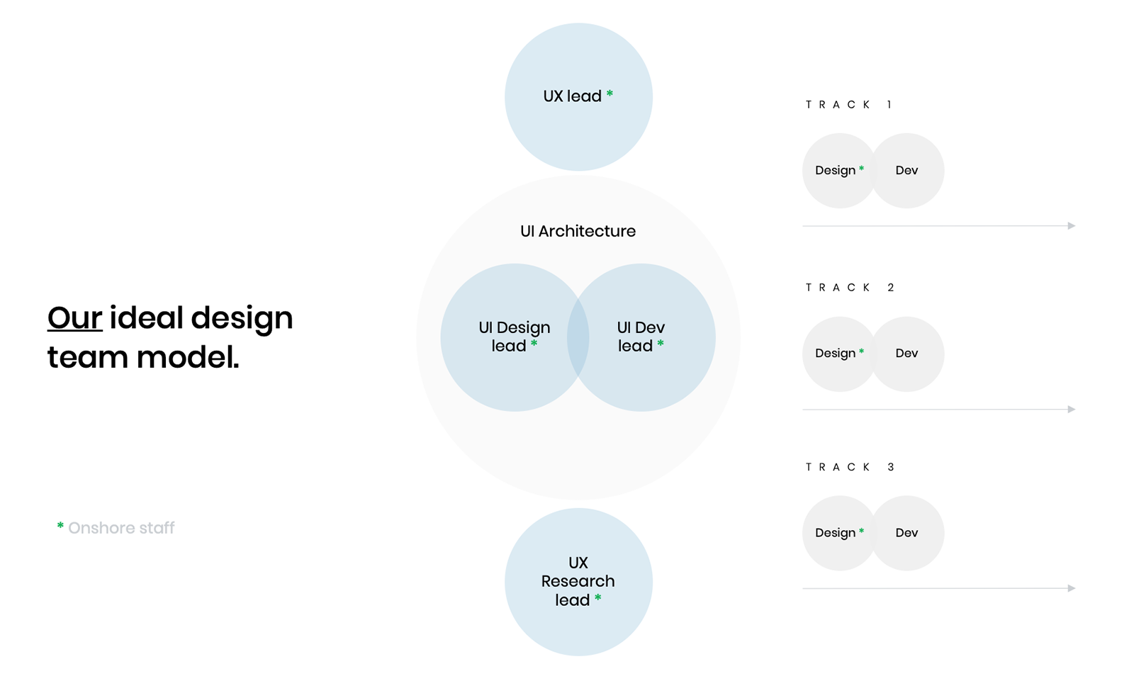
During the weeks following the workshop, the team synthesized all the learnings and put together a design delivery plan. Our goal was to design a new baseline experience for the website and launch it in 12 months. We started with an analysis of the existing user experience. From this, we generated insights that became the new UX and UI design principles. These principlese are creative guardrails that are tied to the customer strategy.
UI Design Principles
Less clutter is more inviting
A user's perception of content that's cluttered and drab can be negative. Simplicity and aesthetic pleasure as features tend to foster more positive attitudes. Utilize effective white space, color and text styling to guide, satisfy and impress users throughout their journey.
References: John Maeda's Laws of Simplicity, Laws of UX
Less complexity is more actionable
Including functionality in more places does not necessarily translate to better usability. We want to balance necessary complexity (and avoid cognitive load), so we can ultimately provide customers everything they need to move quickly through the ordering experience.
References: John Maeda's Laws of Simplicity
Less color is more direct
Use color purposefully and sparingly. We've defined a color system to serve both functional and marketing content types. The goal of the color system is to be flexible enough to provide the business with content styling options that maintains a clear visual hierarchy for every possible scenario.
Designing the eCommerce Experience
The NueVax.com experience is highly complex in both scope and scalability. The new experience needs to be flexible enough to accommodate the needs of large, multi-tiered healthcare systems and smaller independant medical practices. Within these segments, there are several levels of user types with different roles and privileges.
Customer behavior on the website is almost strickly transactional. The site is used, first and foremost, to purchase vaccine products. However, it does also provide account management, invoicing, order shipment tracking, and access to patient educational resources.

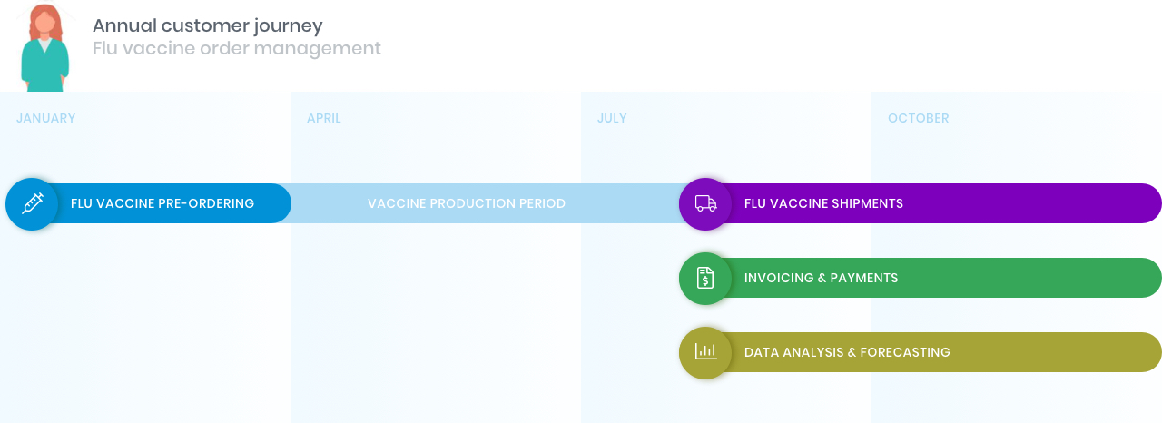
Typical behavioral cycle for a customer ordering influenza vaccines.
UX Goals and Metrics
The majority of the users who are ordering vaccines aren't interested in browsing and spending any more time on the website than they need to. Ordering vaccines for them is just another task they need to fit into their busy office schedule.
This insight indentified a real customer challenge that we turned into UX goals for the phase 1 redesign.
Site Performance
Reduce loading time across the board – This is a big pain point for customers.
We worked with the development team to reduce the current avg. page load time from 3s to 1.5s.
Usability Performance
Reduce the number of steps to complete the order checkout flow.
We reduced the number of clicks to complete the order checkout process from 10 to 6.
Design Phase
The design phase kicked off with 6 weeks of daily requirements gathering sessions to hear from the business stakeholders and technology teams as they demonstrated current state functionality and discussed what was to remain in the new MVP. Our strategist then translated requirements into user story tasks for the design teams to work from. User stories were grouped into Epics and assigned across multiple UX and UI design team pairs.
We adopted a modified agile/SCRUM delivery model that estimated our entire design phase lasting about 15 (2-week) design sprints with usability testing and feedback implementation planned in between each sprint. We met with the Product Owner daily to demo and receive feedback on all our work-in-progress.

After a Sprint, we ran usability tests with actual customers to get feedback.
Fast-forward 6 months later, we completed the design for the MVP relaunch date. Considering the complexity of the business rules and the wide scope of the entire sitemap, the design team was proud to deliver an end-to-end user experience in this timeframe.
Our atomic UI architecture is what enabled us to do so.
UI Architecture
Defining "how" the user interface is designed, built and maintained is a crucial step that needs to be clearly defined and understood upfront, amongst all team members. Why? Because if design and dev teams aren't aligned on the methodology, the designs and code will not be compatible and communication between domains will breakdown and mistakes will continue to be made. We ran into this issue early on as a team.
What we realized is our design team thinks of the UI experience as reusable, modular components - but our dev team thinks and builds from static page layouts. Our architectures are fundamentally different.
We’re not just designing pages anymore, it's terribly inefficient and not scalable. Instead, we’re designing, building and maintaining a system of reusable components.
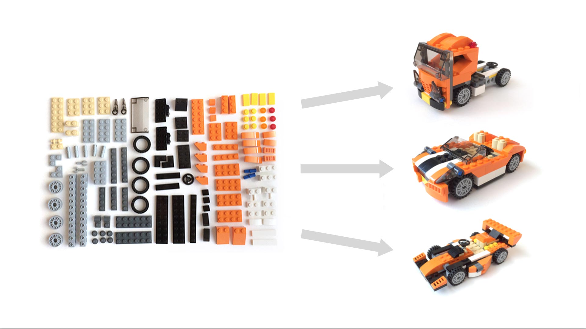
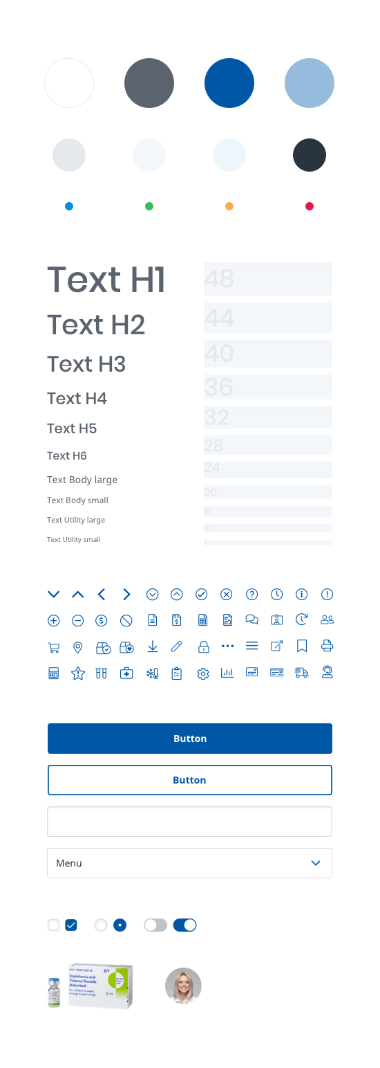
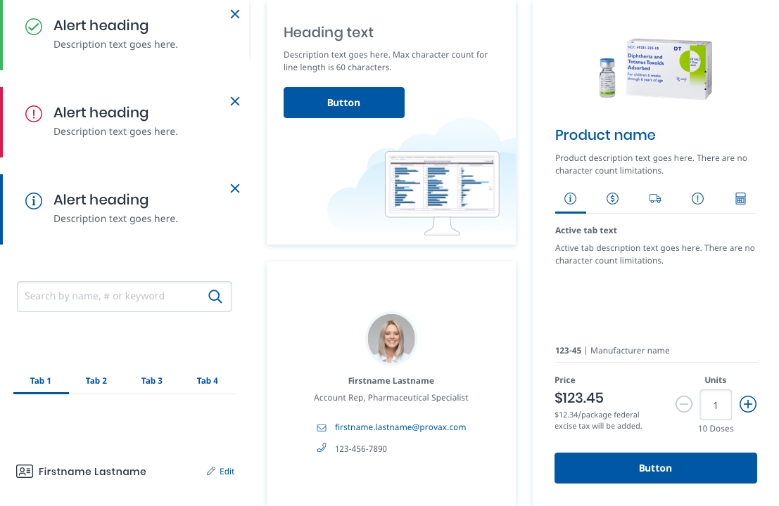
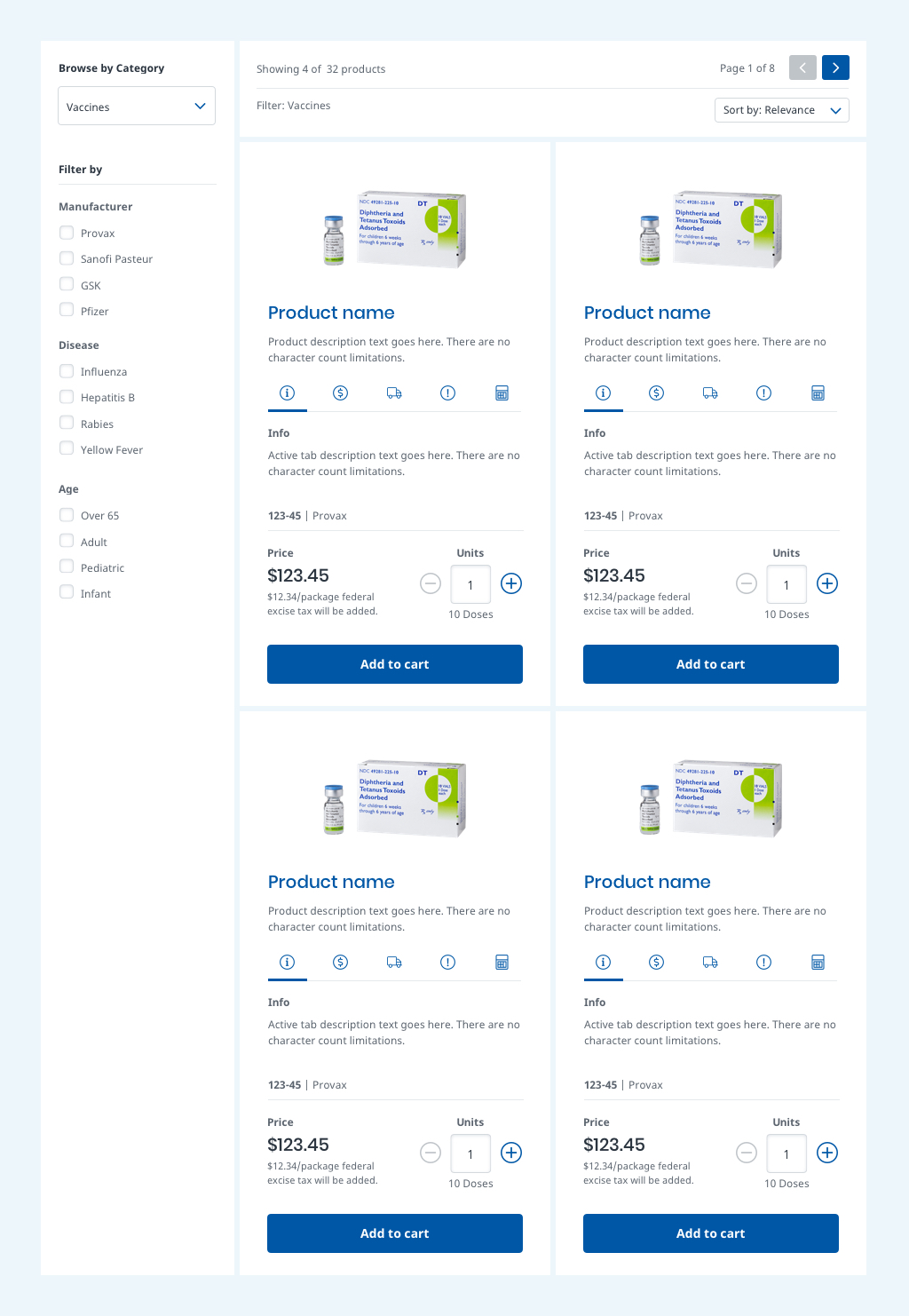
This UI architecture is referred to as Atomic Design. The structure of the UI is broken down into its smallest parts, which are combined and built-up into larger parts we call components. Components are modular units that are combined into page layouts. Lego is a really great analogy for atomic design. UIs are essentially modular building blocks that can be combined in different ways.

Image adapted from "Atomic Design" by @brad_frost and "Multiscreen UX Design" by @wolframnagel.
It's a powerful model that we decided to adopt for NueVax for a number of reasons. For one, it addresses the long-term tech debt issue that they've dealt with. We can't eliminate 100% debt over time, but we can get pretty close if we keep up with the maintenance of the atomic component system. The business benefits financially from long-term cost $avings of not having to redo everything in the near future.
Other benefits:
Modularity
Atomic design is inherently modular, which is a property that naturally enables UI consistency across all device sizes.
Reusability
Reusable UX/UI patterns simplify the user experience, resulting in faster learnability for the users.
Acceleration
Design and development production velocity increases over time.
We estimated an average +25% increase in production velocity once we applied our design system to net new UX designs.
The big challenge for the design team was to apply our atomic system thinking to NueVax.com's 15 year old interface. Multiple business teams had gotten use to editing the website content themselves, without adhering to any styleguide standards, resulting in a confusing user experience.

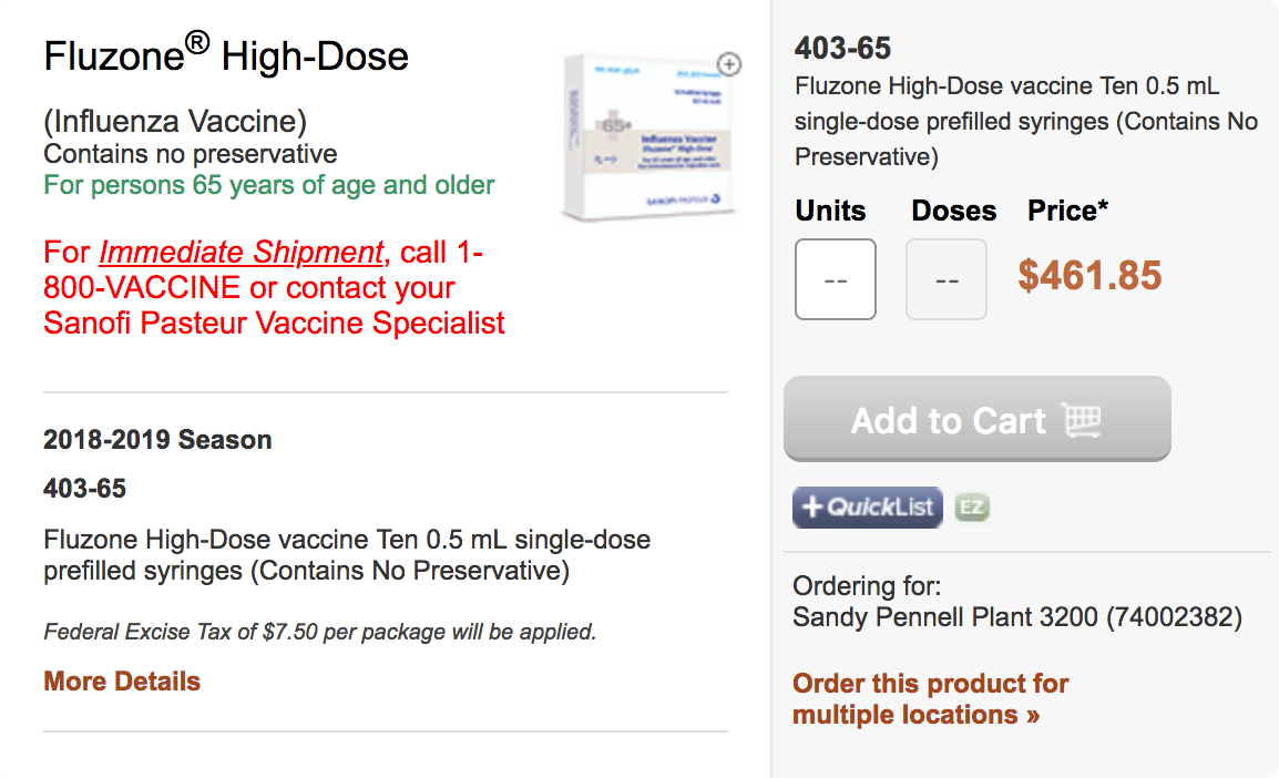
Image of a vaccine product listing from the original website. You'll notice the many different font styles, icon badges, and call-to-actions being used. There is no clear hierarchy of information, which leaves the user unable to focus on anything.
We took a step back and decided to run a proper interface inventory audit, which helped us look at all the existing UI from a bird's eye view and reorganize it. We were able to boil everything down to a new core set of UI elements that would become the building blocks for all our components and page designs.

